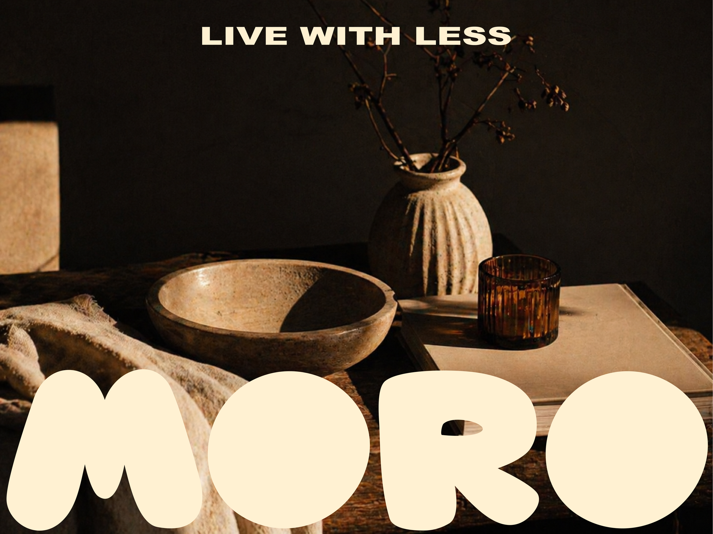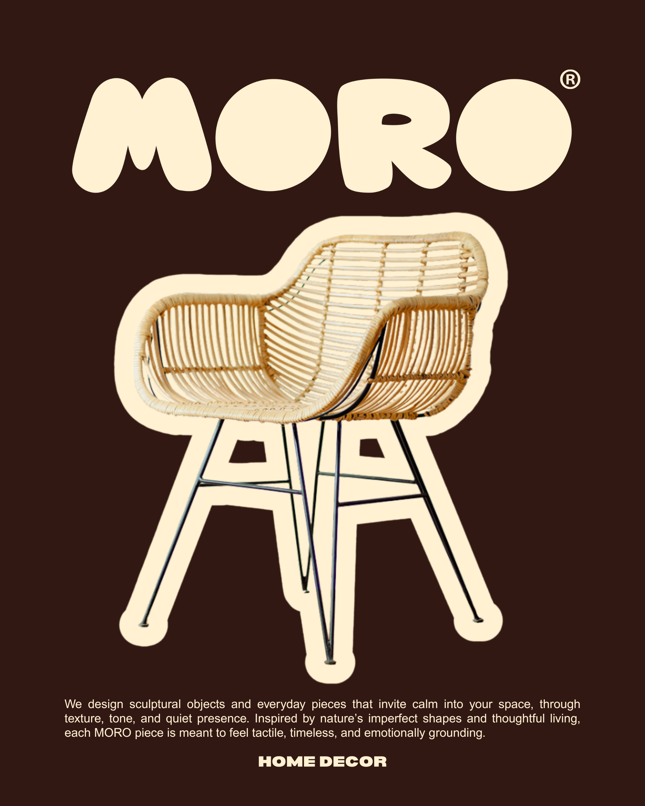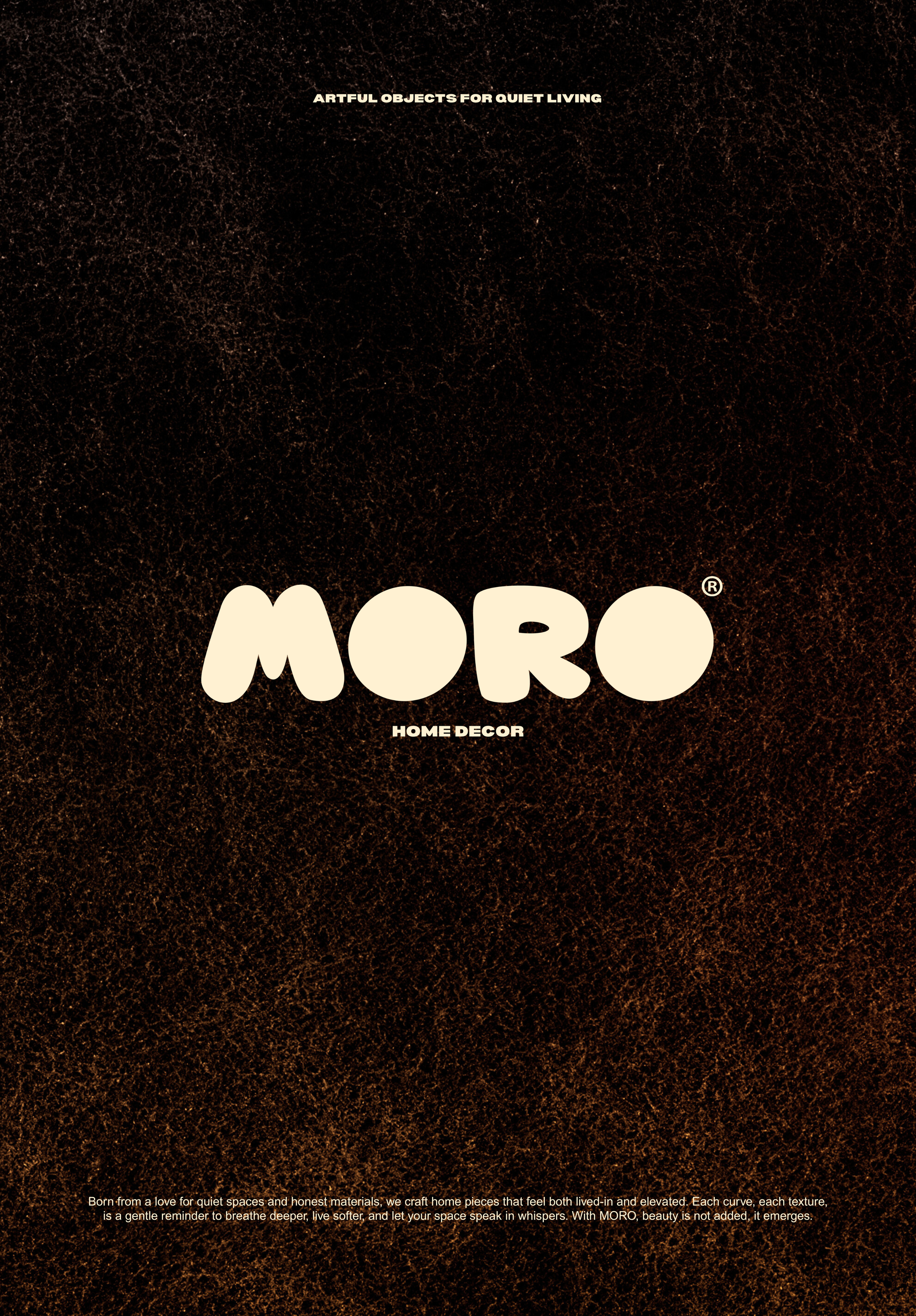
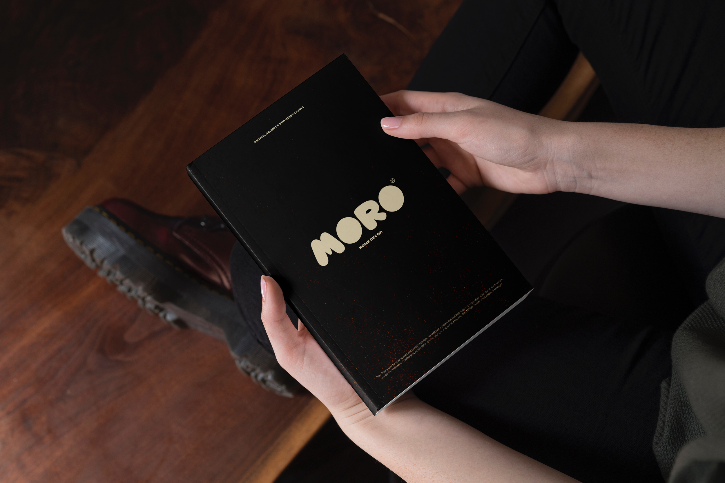
MORO -
HOME DECOR
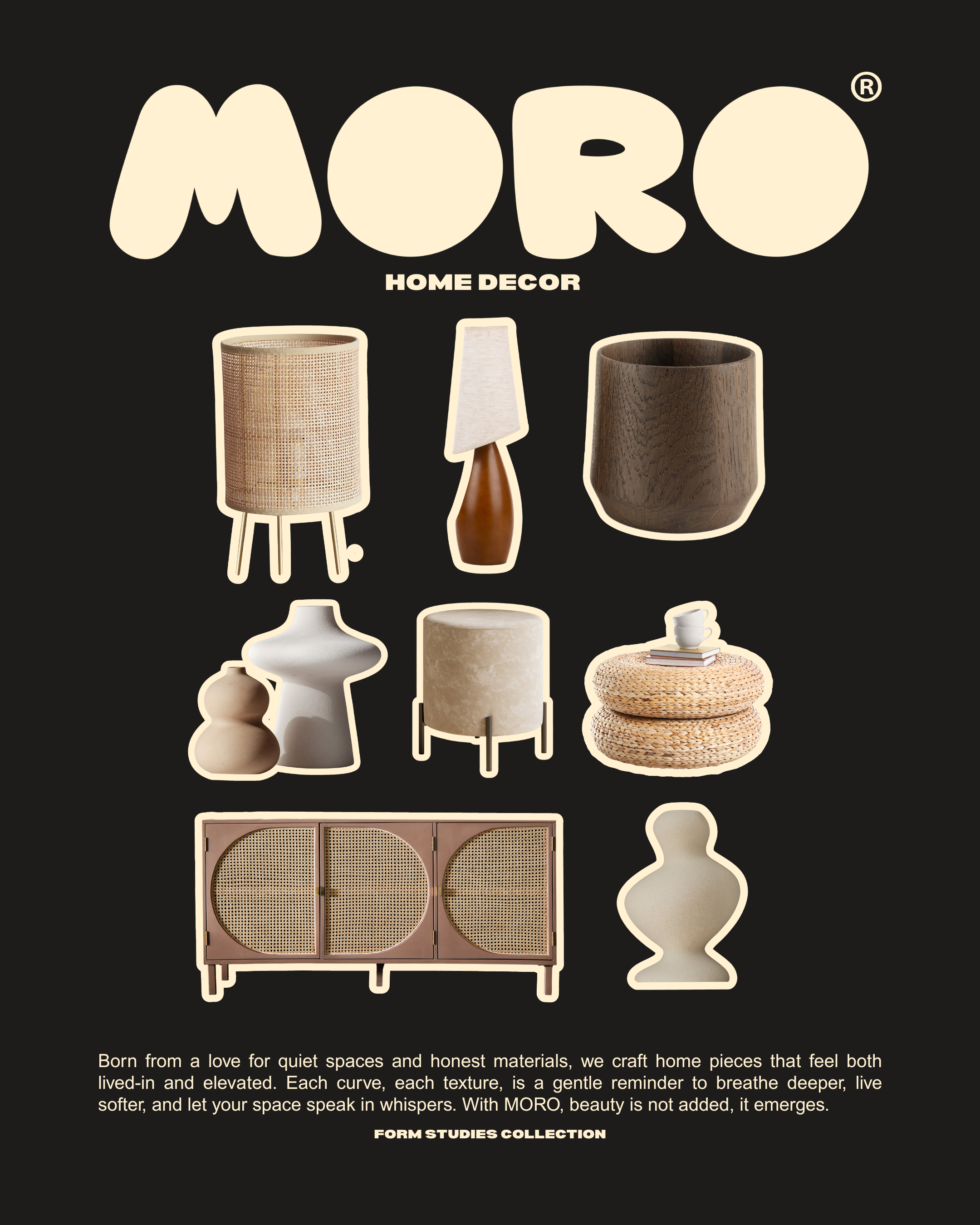
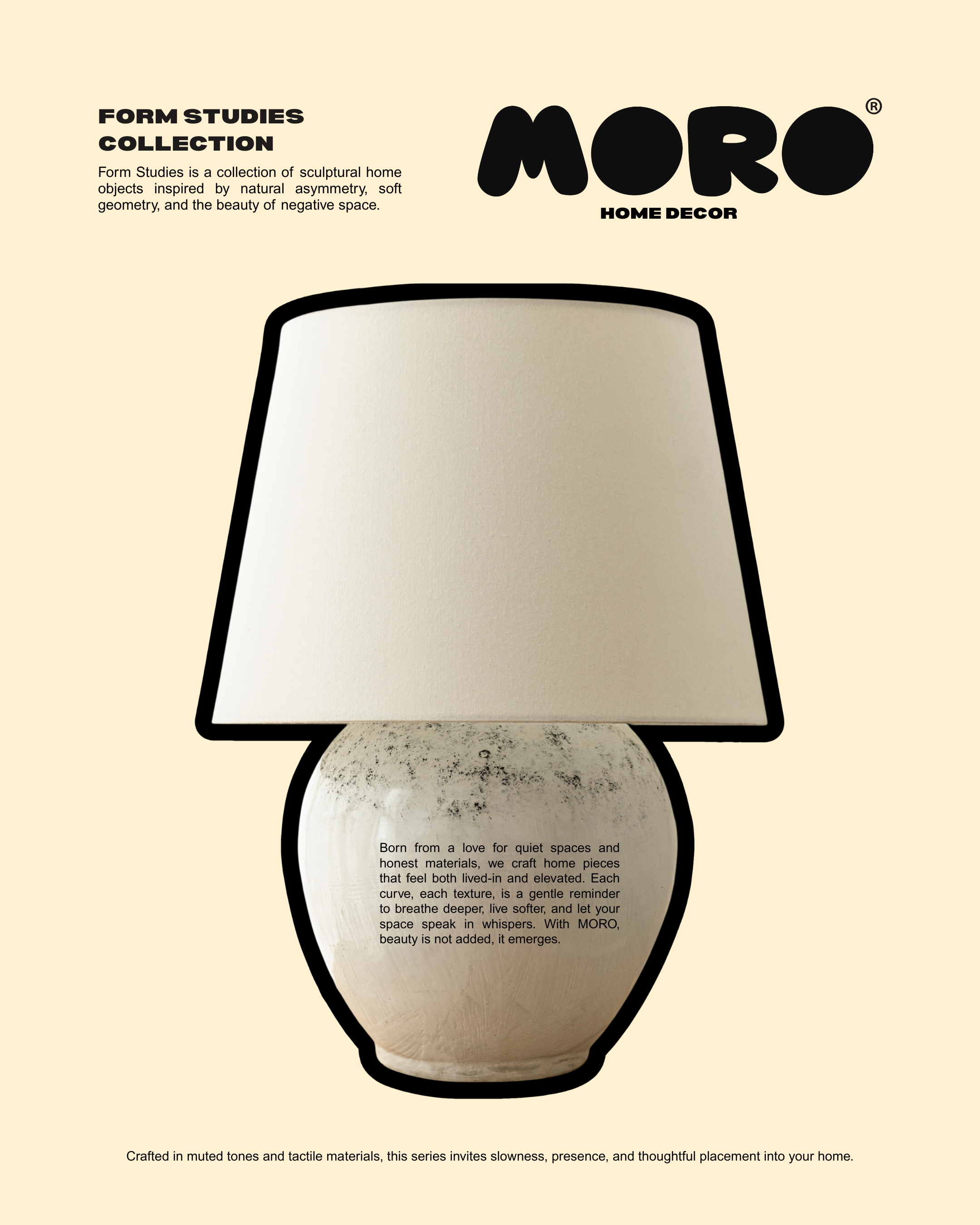
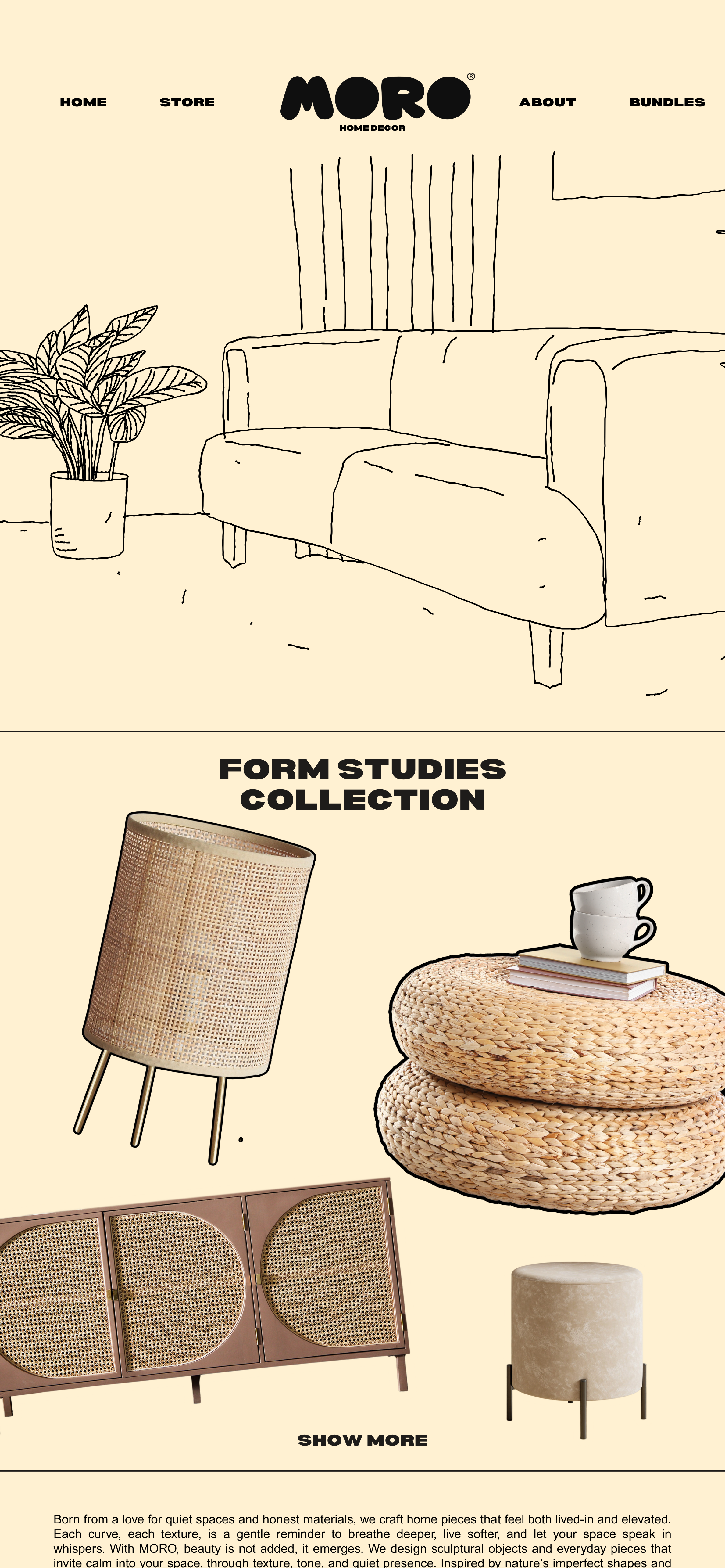
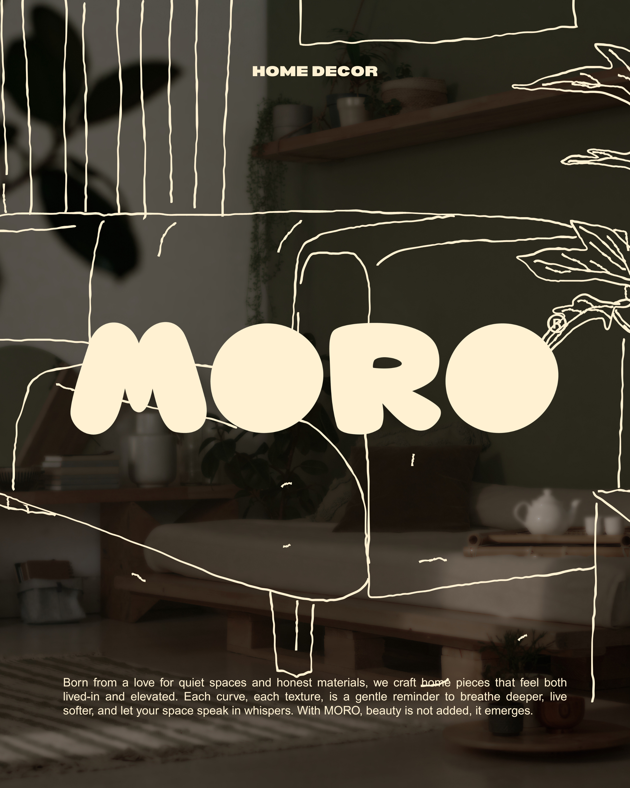
MORO is a home decor brand built around stillness, softness, and sculptural simplicity.It celebrates objects that don’t demand attention, but slowly become part of your space, your rhythm, your everyday.
✦ Visual Direction
The visual identity draws from:
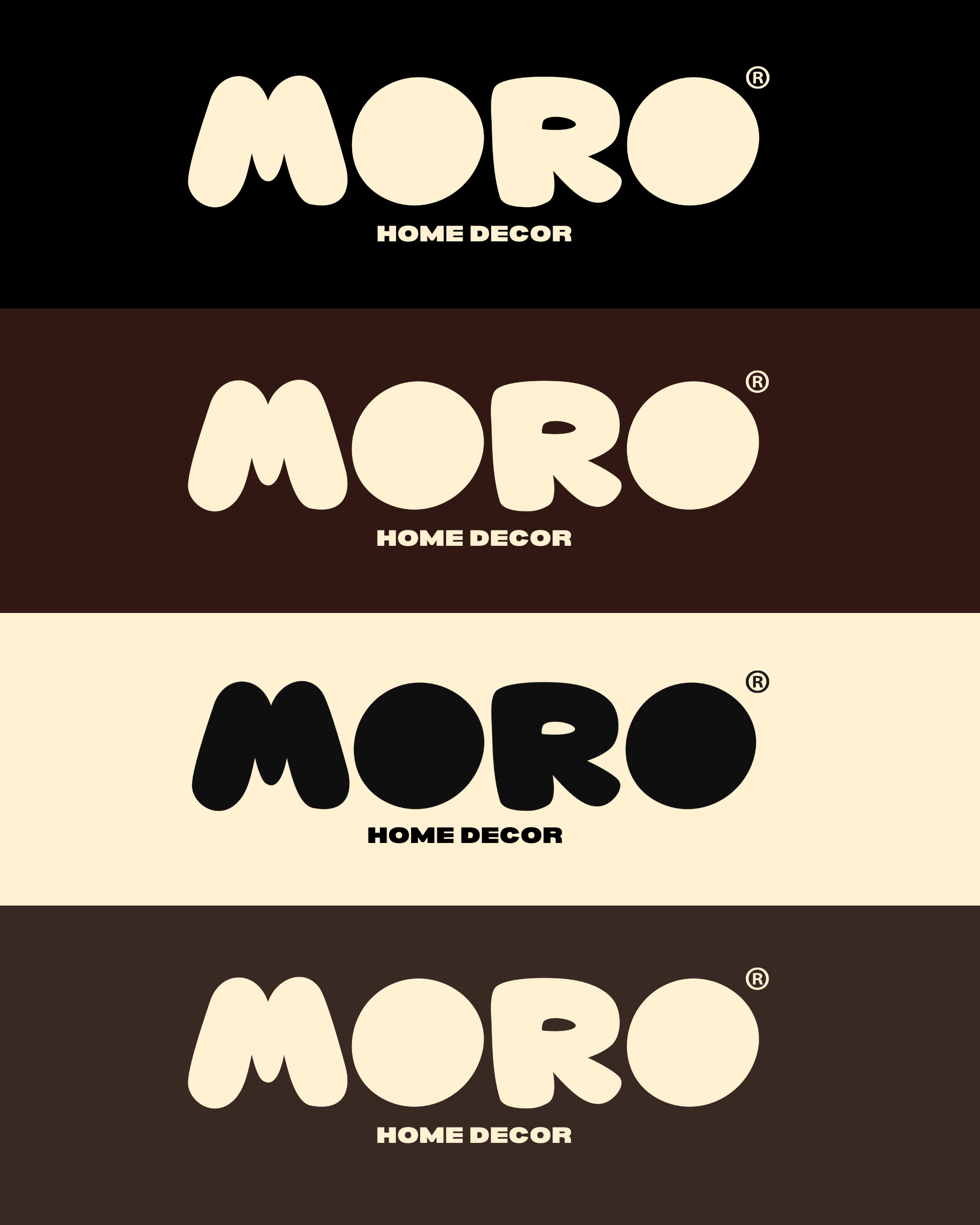
Earthy, desaturated tones (cream, brown, muted beige)
Soft contrasts with deep, grounded backgrounds
Rounded, imperfect forms inspired by nature
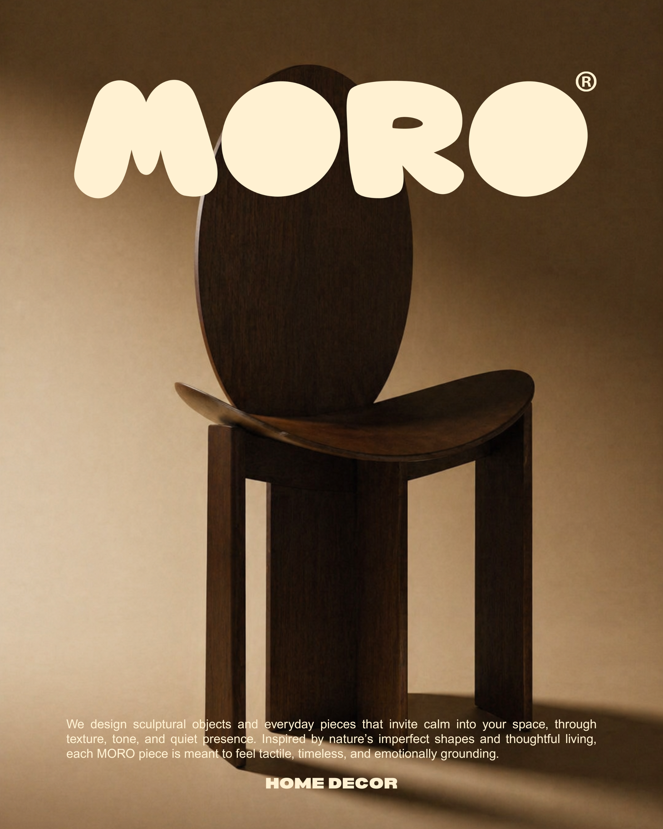
A balance between playful typography and refined minimal layouts
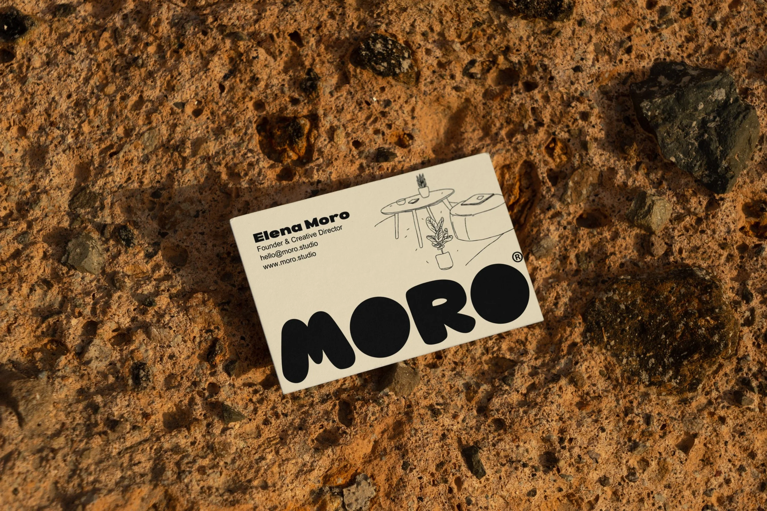
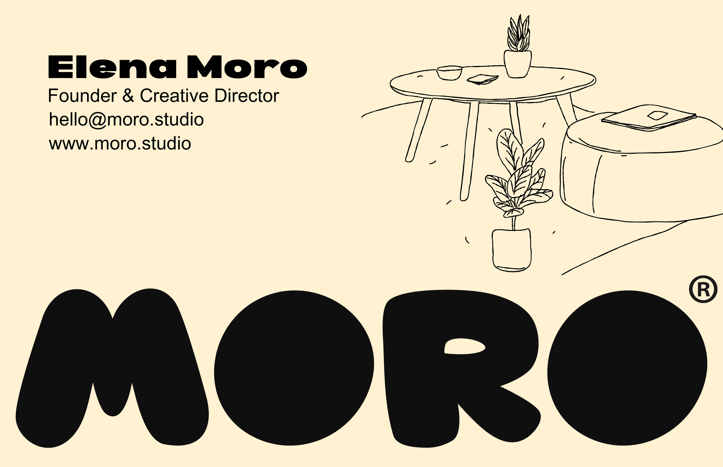
The bold, almost childlike logotype contrasts with the calm product language, creating a brand that feels both approachable and elevated.
✦ Visual IdentityMORO explores the idea that beauty doesn’t need to be loud to be felt.
The brand is rooted in warm minimalism, where organic forms, muted tones, and tactile materials come together to create a sense of calm.
Each piece is designed to feel grounded, timeless, and quietly expressive, blending functionality with sculptural presence.

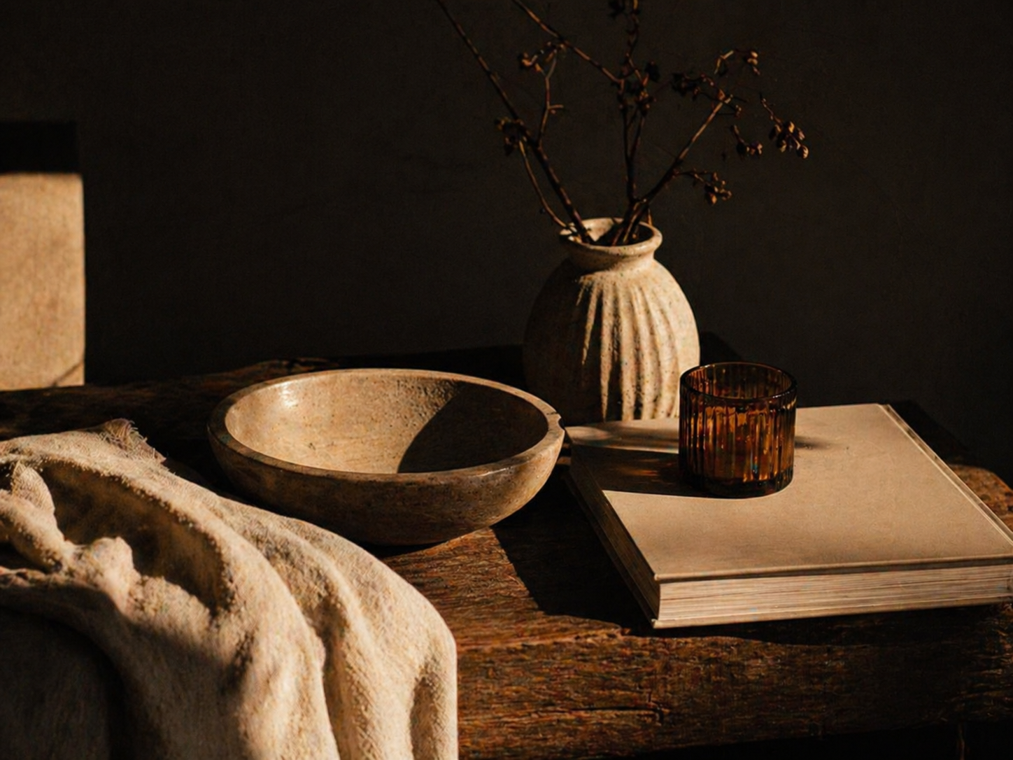
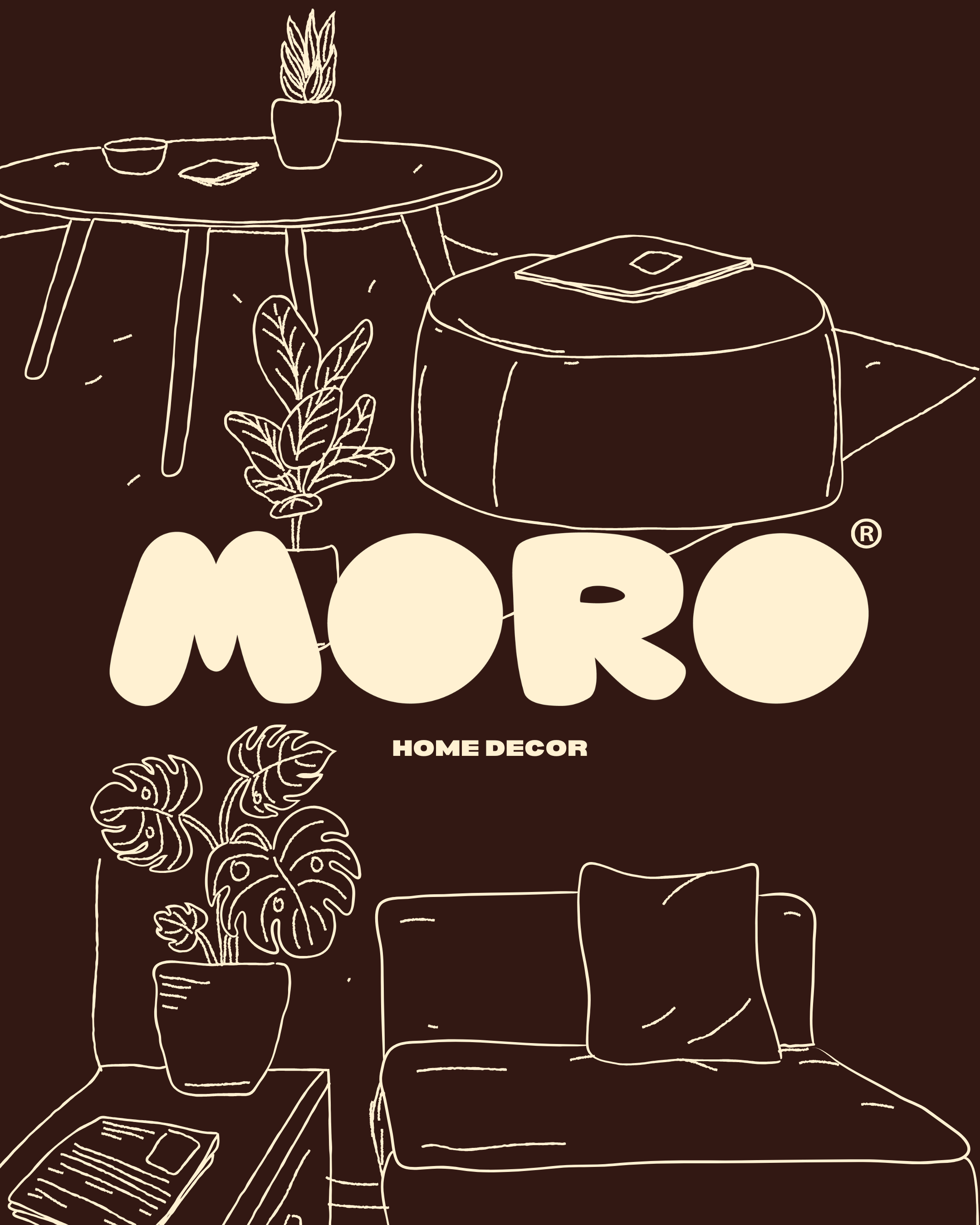
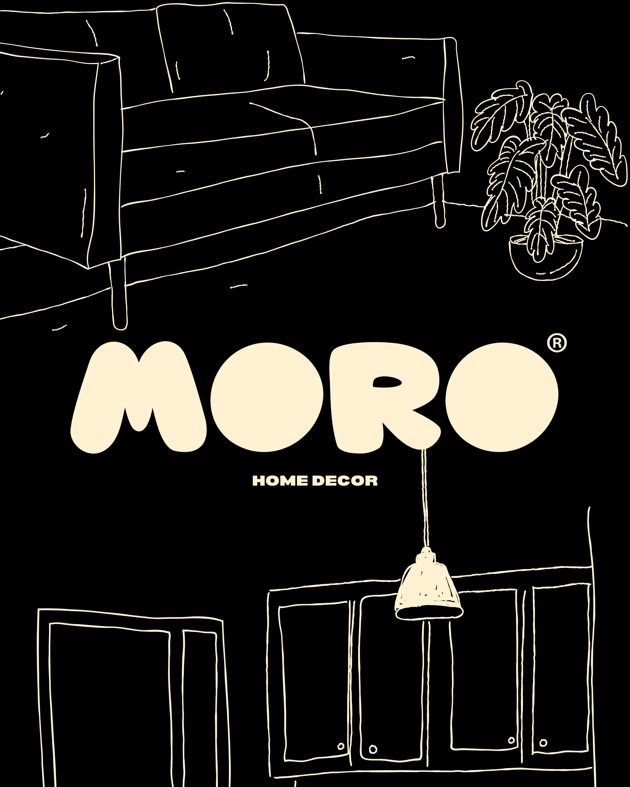
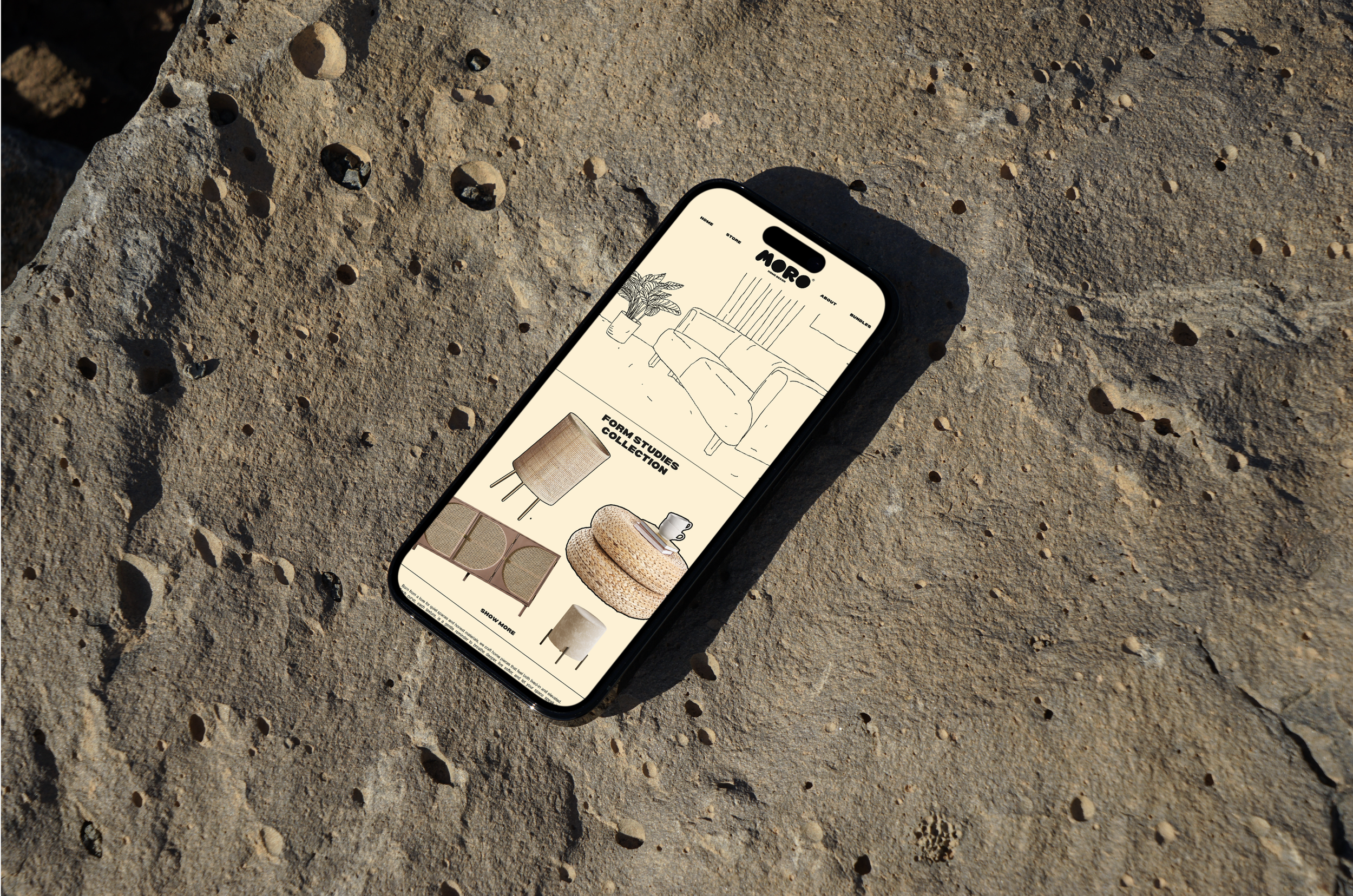
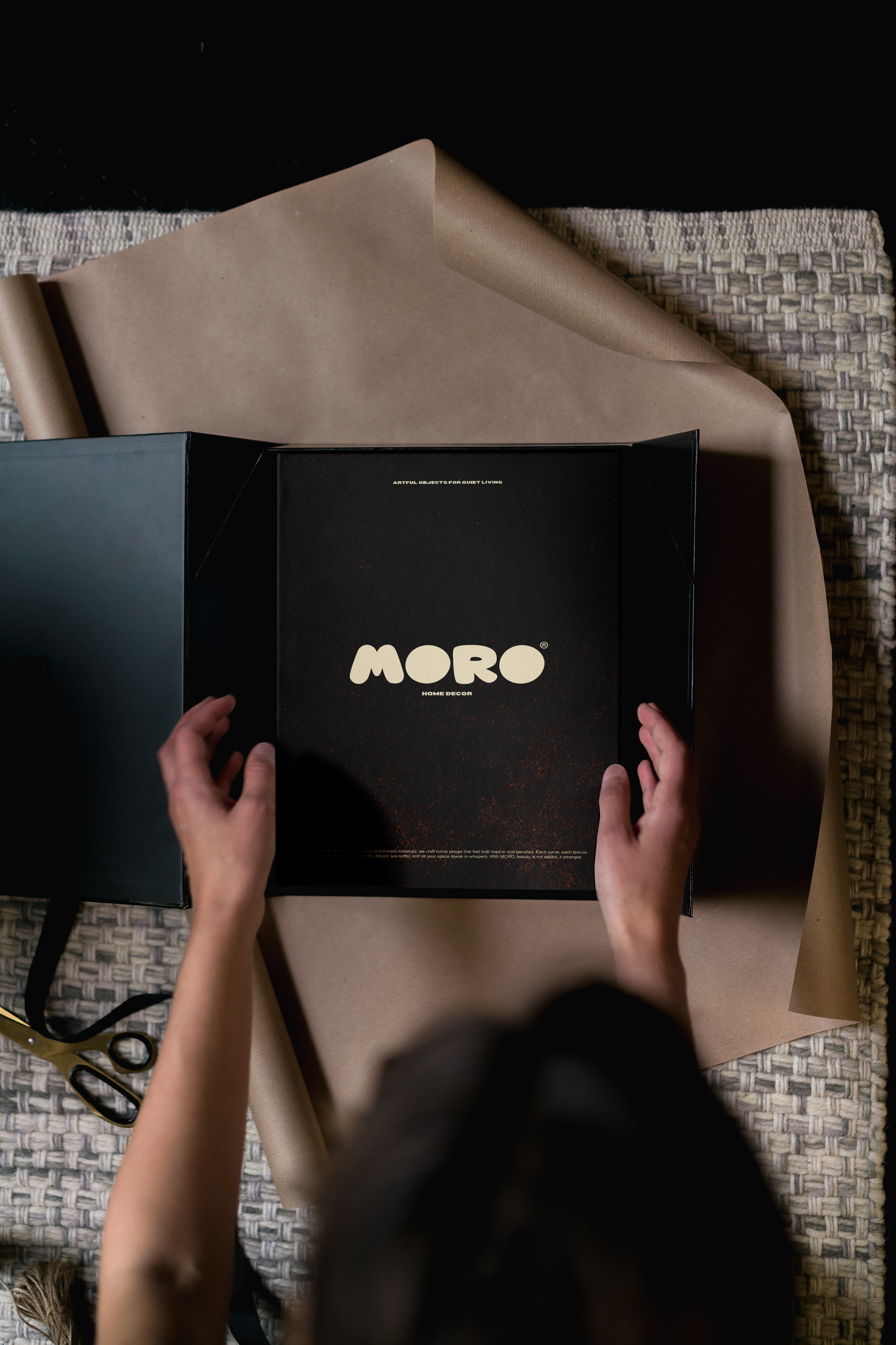
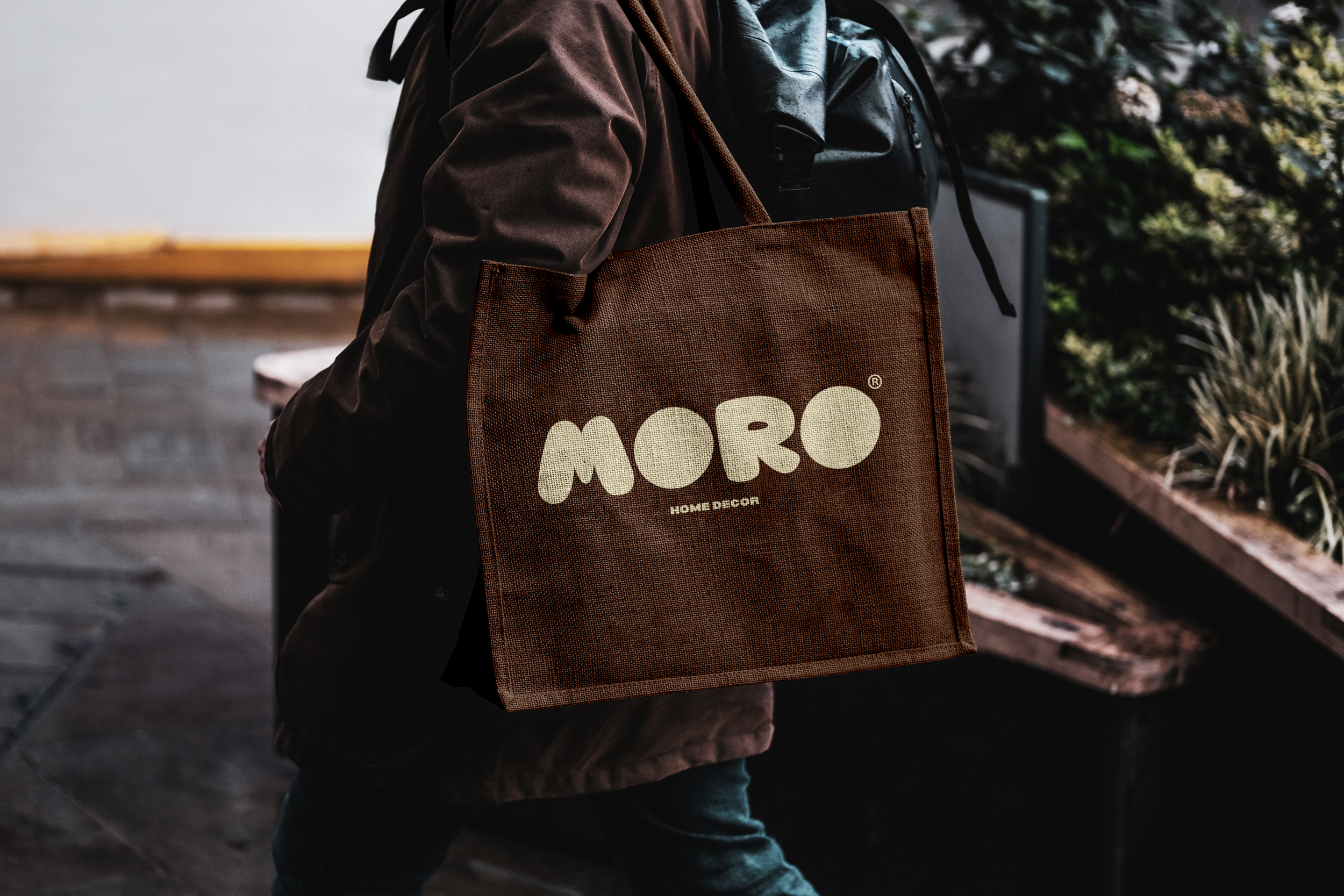
✦ Photography Direction
The photography follows a low-key, cinematic approach:
Warm, directional lighting with deep shadows
Film-inspired grain and texture
Focus on materiality: wood, rattan, ceramic, fabric
Objects treated as sculptures rather than products